
Where earthly brews meet celestial whispers, crafting Jun elixirs that resonate with cosmic energies.
222 Jun
Role
Art Director, Branding, Packaging
Timeline
3 months
Skills
Photoshop, Illustrator, Figma

The Vision
At 222 Jun, we envision a world where every sip of our Jun beverage is a celestial connection. The number 222 reminds us of divine timing, synchronicity, and trust in the universe. Our vision extends to the stars—a cosmic dance where Jun flows like stardust. We aspire to be celestial artisans, weaving magic into each bottle.
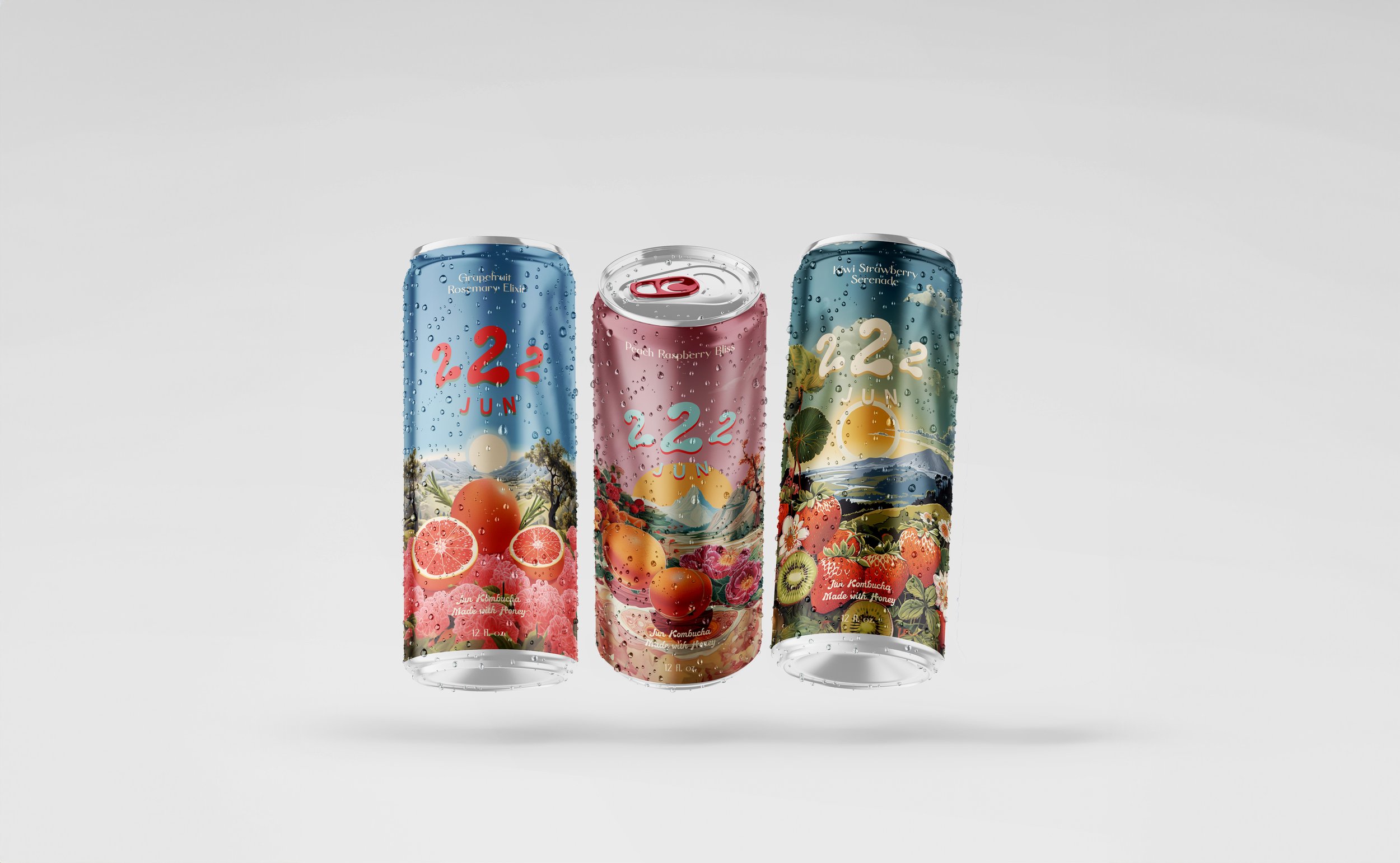
Logo
Our hand-crafted logo is designed to reflect the organic nature of our products. The style should convey a friendly and earthy vibe. This is our primary logo and should be used in every circumstance.
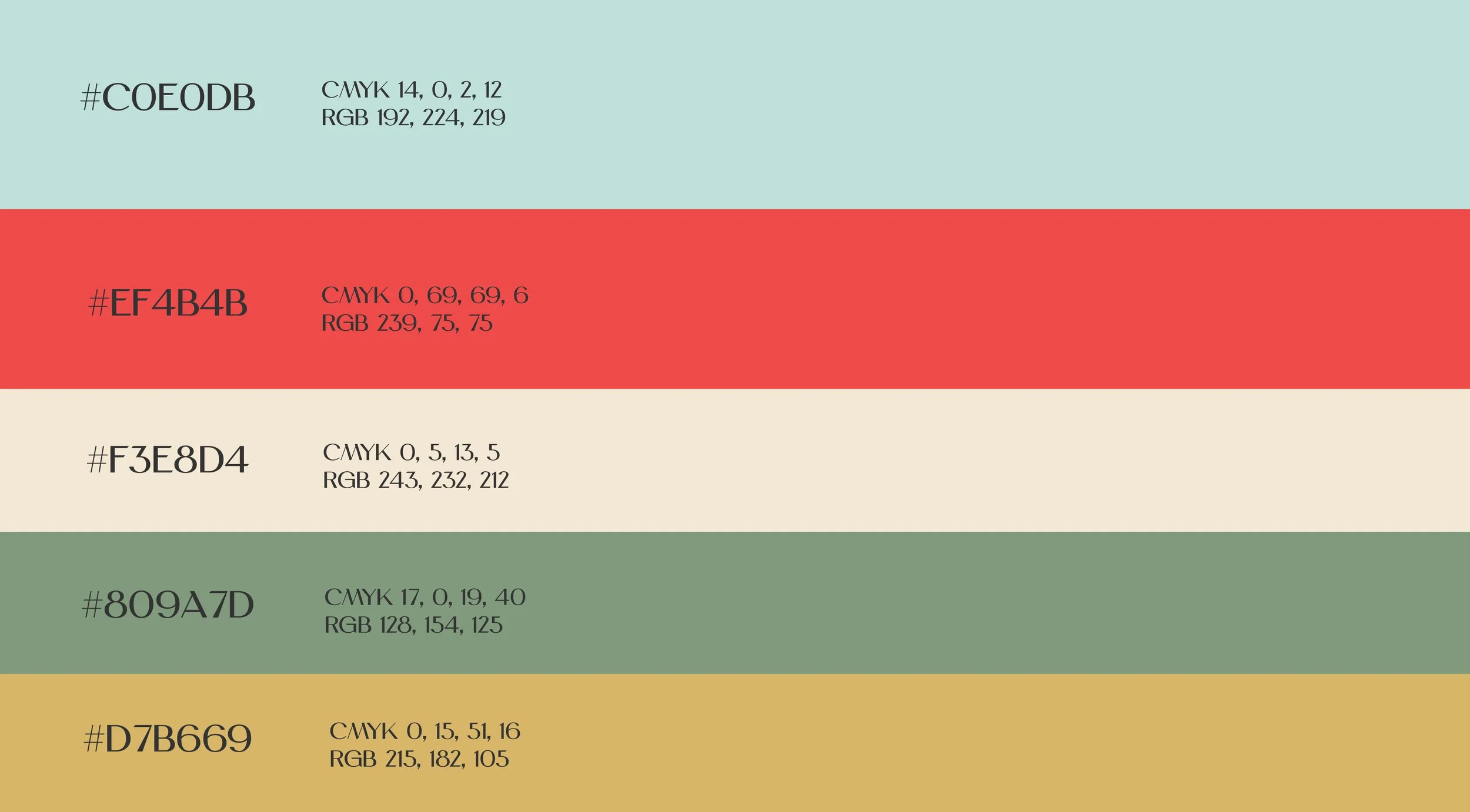
Color
The colors outlined below constitute our primary palette, serving as the foundational hues within our system. These colors should be prioritized and employed predominantly, especially in scenarios where the palette options need to be constrained.
To the right, you will find a demonstration showcasing the proper utilization of this palette. This example illustrates the effective and intended application of our core colors in harmony.
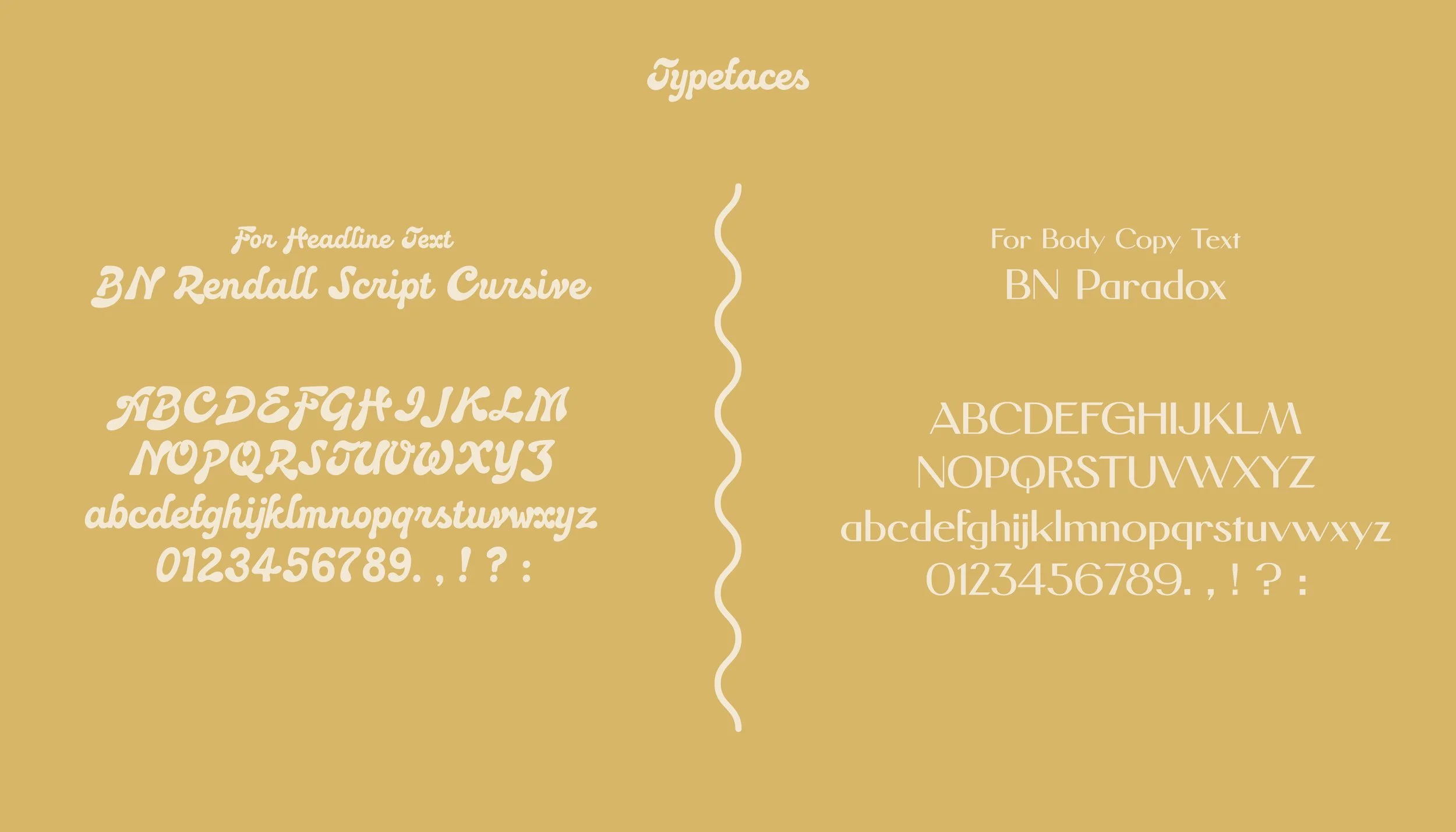
Type
The selected typography, BN Rendall Script Cursive alongside BN Paradox, both creations of Brandon Nickerson, embody the quintessential blend of form and function. The Rendall Script Cursive, with its bold and idiosyncratic flair, was the ideal choice for the brand's headline font, encapsulating a unique and striking aesthetic.
BN Paradox, in contrast, is a study in minimalist design, employing simple shapes and a juxtaposition of weights to craft an aesthetic that is both elegant and inviting. This typeface serves as the perfect complement for body text, offering a serene counterpoint to the vivacity of the header font.
The deliberate pairing of these contrasting fonts establishes a visual hierarchy that not only enhances the brand's visual narrative but also underscores the desired allure with precision and grace. This typographic strategy is instrumental in sculpting a brand identity that is both cohesive and compelling.
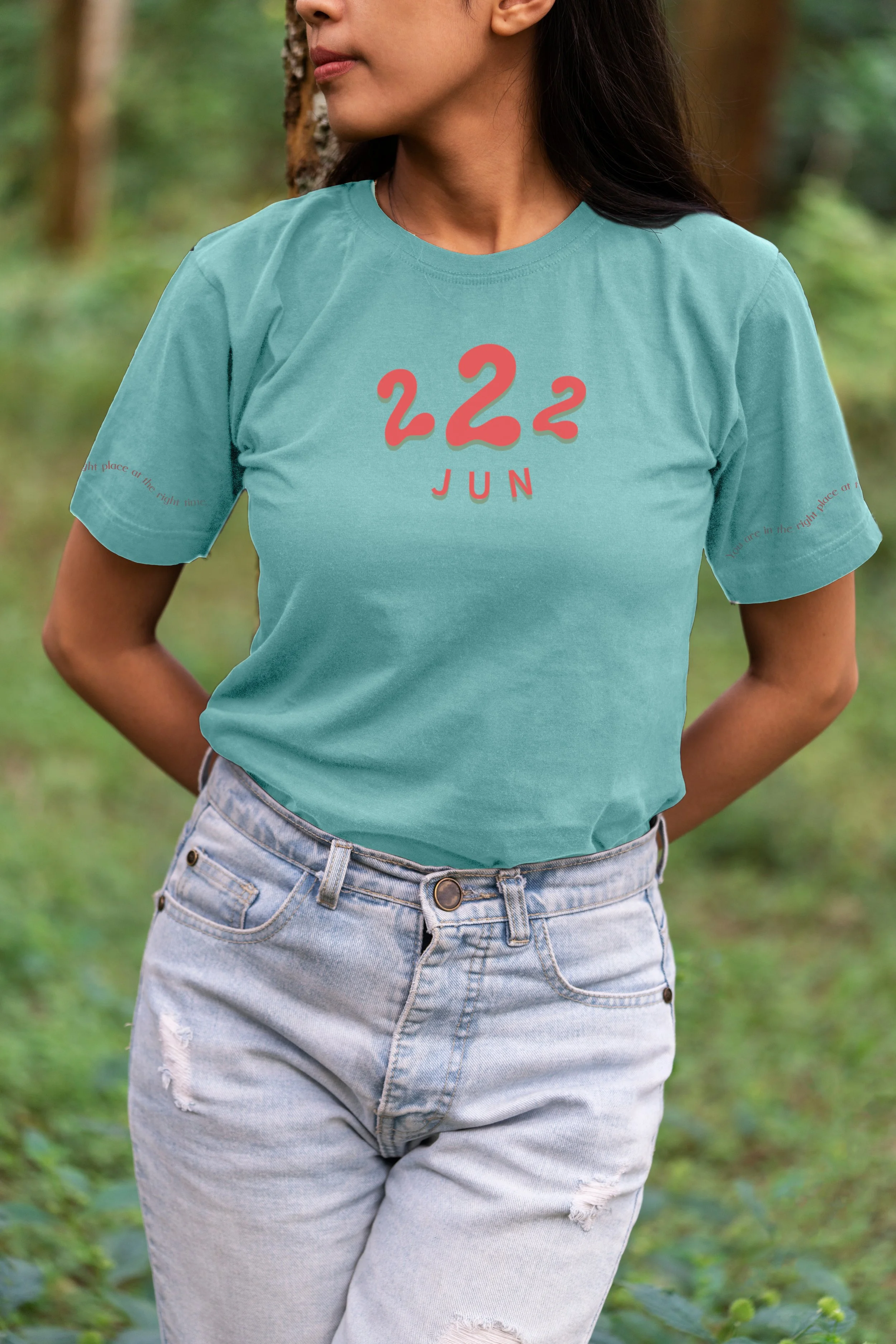


Merch & Marketing Assets
The branding should seamlessly translate into merchandise and marketing assets. The brand's primary colors should be used, while advertising should echo the brand voice and be visually compelling. The logo and product image must be applied to a minimal background with additional dynamic elements, but the product is the focal point of the design.
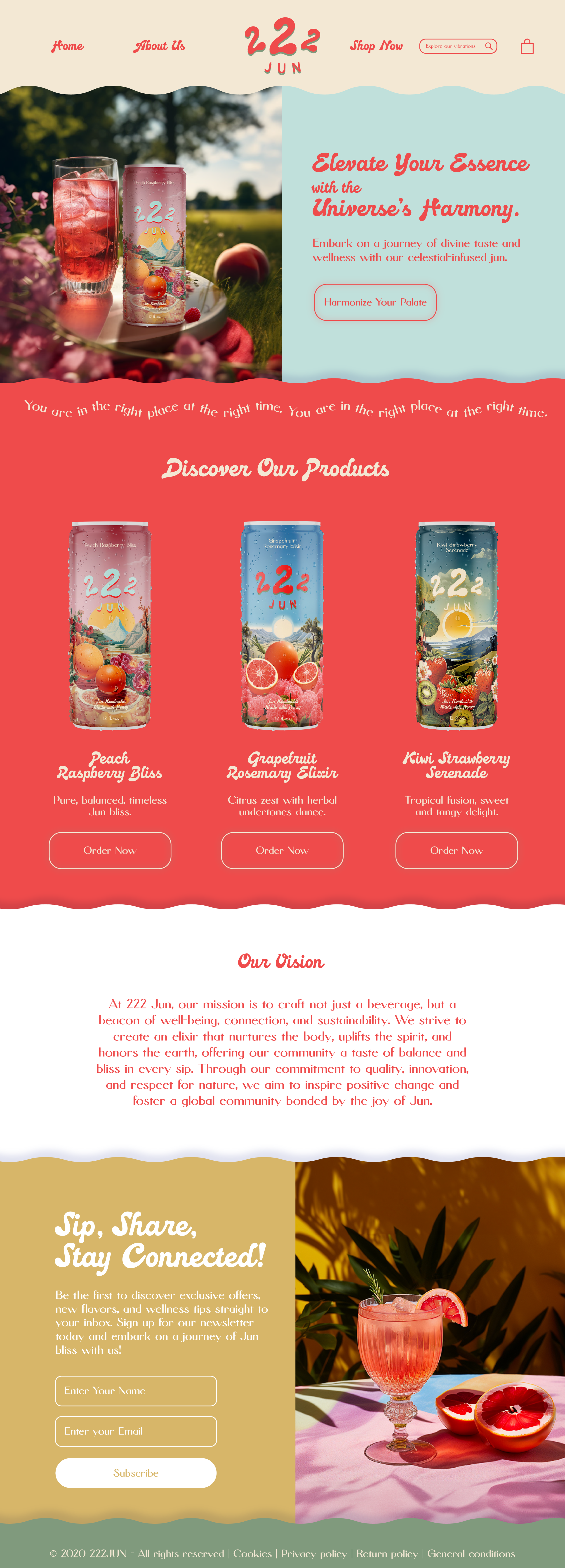
Web Application
In the design of the web application, I meticulously adhere to the 60-30-10 rule for the application of brand colors, ensuring a harmonious visual balance. My objective is for the background to adopt a more unified color scheme, thereby allowing the product or lifestyle imagery to command the viewer's primary focus.
Furthermore, the section dividers have been thoughtfully crafted to exude a sense of playfulness, enhancing the overall user experience. The selection of color combinations is strictly in alignment with the guidelines specified in the color guide presented earlier, ensuring consistency and coherence throughout the design.


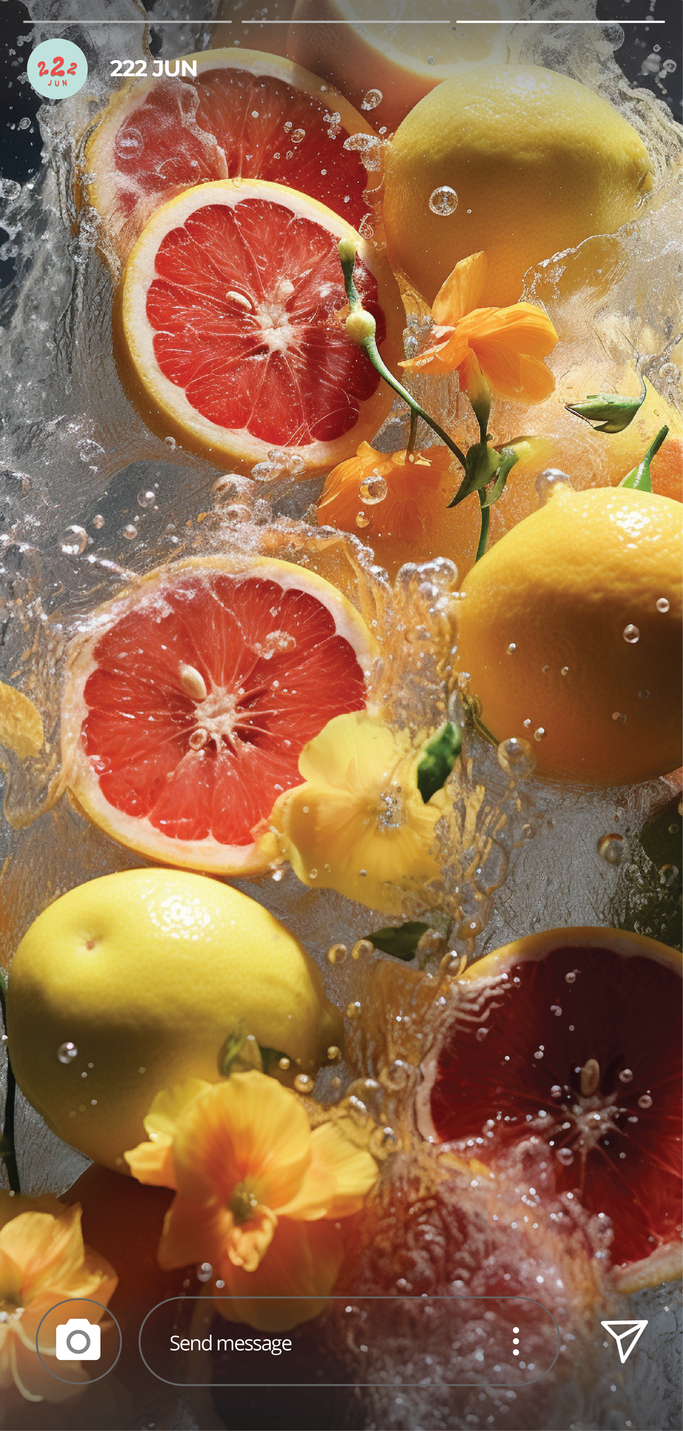

Social Media
The photographic style should embody the brand's focus on a free-spirited ethos. Both the use of color and the overall visual narrative should align seamlessly with the brand's message of balance and harmony.
The social media page for 222 Jun should showcase the end user, portraying their lifestyle, values, and how the product seamlessly integrates into their daily life.
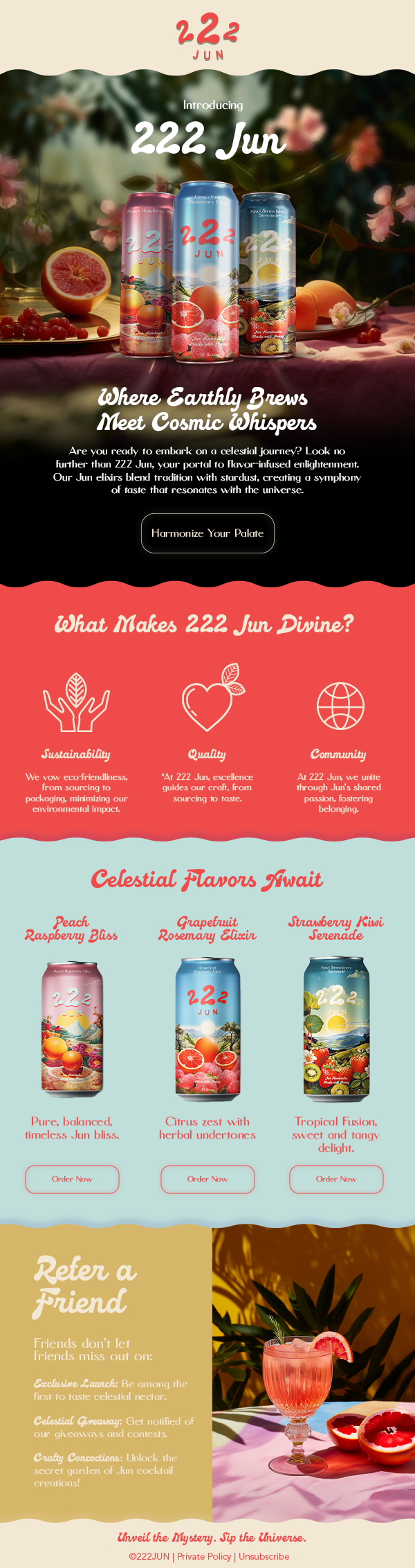
Email Marketing
The email marketing design seamlessly extends the brand's online presence, serving as a vital channel to engage and inform our community. Through carefully curated content, 222Jun aims to foster meaningful connections with our customers, providing them with valuable insights and updates tailored to their interests.